Nicolas Roose's Designs
Inside every bad flag there's a good flag trying to get out, so I simplified the current flag by stripping all of its lettering and symbols and I ended up with 24 variations (OKC-All).
The idea was to select three related flags for three Oklahomas: the State of Oklahoma, Oklahoma County and Oklahoma City.
For example :
State - County - City
6 - 2 - 4
7 - 3 - 1
8 - 22 - 10
4 - 19 - 13
... ... ...
For this OKC Flag Project however, I will limit my submission to what I believe are the three best looking versions.
I submit flags number 1, 6, and 14.
All of my flags adhere to the basic principles:
- Keep it Simple:
A child can draw them from memory
They are easily recognizable from afar
- Use Meaningful Symbolism:
"O" for Oklahoma
A city in the center of it's namesake state (and county)
Unity (the circle as a group of socially interconnected people)
in a city both permanent and dynamic (like wheels, atoms, sun and moon)
-Use two or three basic colors:
Sky-blue from the state flag (see also: OKC Thunder)
White from the city flag
Red (darkened) from the city seal
- No seals or lettering:
Inspired by a seal, but not a seal
Inspired by a letter, but no writing
- Be Distinctive or Be Related:
Distinctive in its simplicity
Related to the sky-blue and the shape of the shield in the state flag
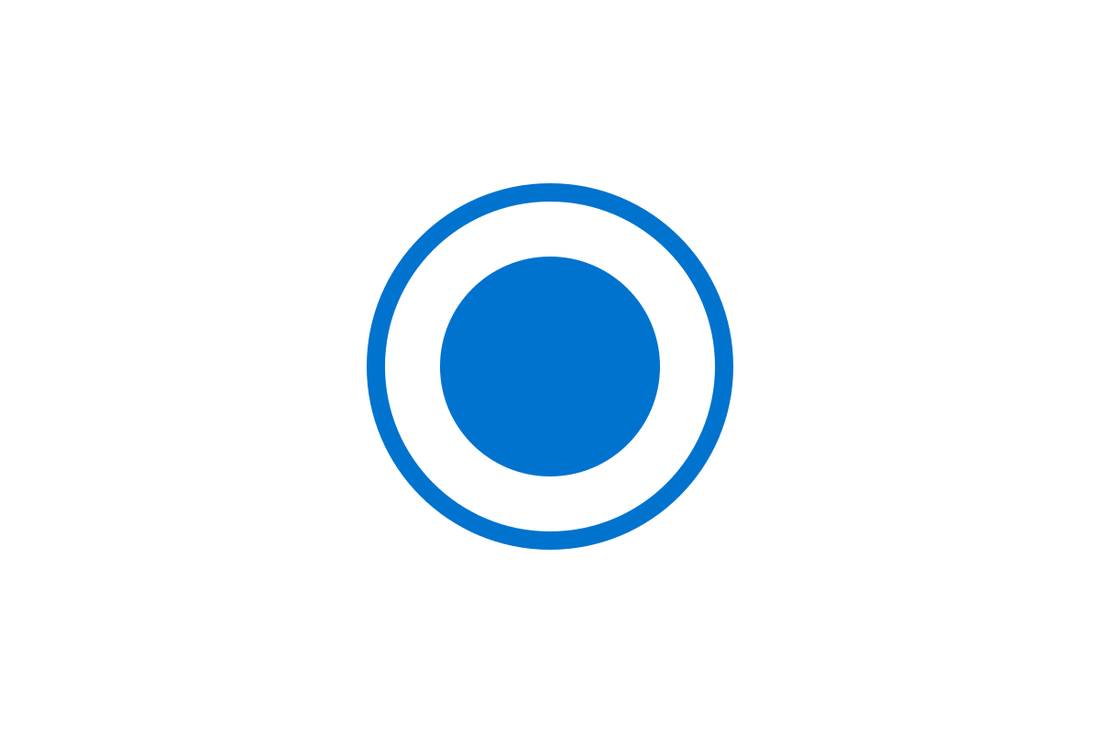
Flag number 1 (OKC-001):
- retains the current flag's white background
- reflects the Oklahoma City seal
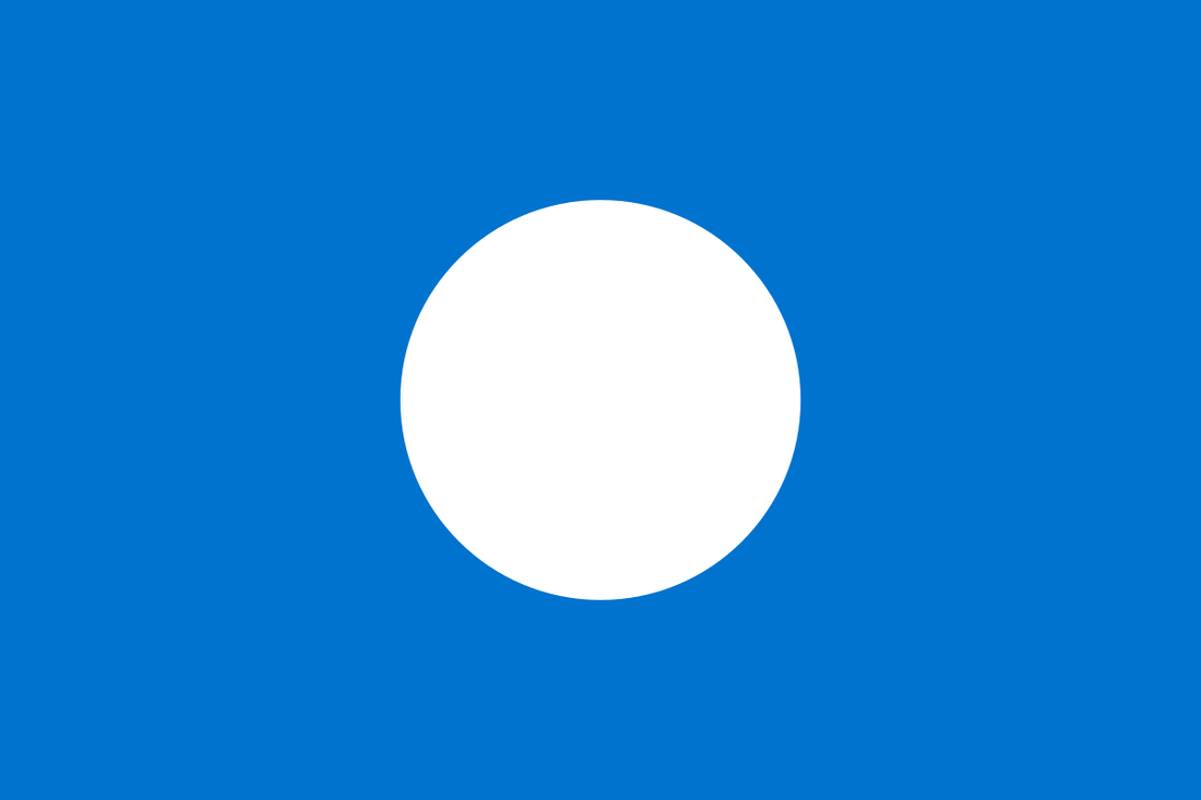
Flag number 6 (OKC-006):
(my personal favorite)
- looks very attractive on a flagpole from distance
- offers great opportunities for city marketing and civic pride
- is preferred over its sister (OKC-005) which is basically a blue Japan
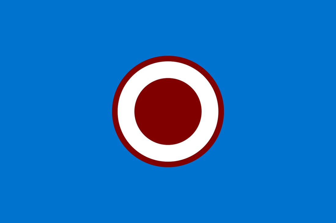
Flag number 14 (OKC-014):
- For those who want to keep the red color from the city seal
- in close competition with 10 and 20
- the red boundary makes it look less like an aircraft roundel
The idea was to select three related flags for three Oklahomas: the State of Oklahoma, Oklahoma County and Oklahoma City.
For example :
State - County - City
6 - 2 - 4
7 - 3 - 1
8 - 22 - 10
4 - 19 - 13
... ... ...
For this OKC Flag Project however, I will limit my submission to what I believe are the three best looking versions.
I submit flags number 1, 6, and 14.
All of my flags adhere to the basic principles:
- Keep it Simple:
A child can draw them from memory
They are easily recognizable from afar
- Use Meaningful Symbolism:
"O" for Oklahoma
A city in the center of it's namesake state (and county)
Unity (the circle as a group of socially interconnected people)
in a city both permanent and dynamic (like wheels, atoms, sun and moon)
-Use two or three basic colors:
Sky-blue from the state flag (see also: OKC Thunder)
White from the city flag
Red (darkened) from the city seal
- No seals or lettering:
Inspired by a seal, but not a seal
Inspired by a letter, but no writing
- Be Distinctive or Be Related:
Distinctive in its simplicity
Related to the sky-blue and the shape of the shield in the state flag
Flag number 1 (OKC-001):
- retains the current flag's white background
- reflects the Oklahoma City seal
Flag number 6 (OKC-006):
(my personal favorite)
- looks very attractive on a flagpole from distance
- offers great opportunities for city marketing and civic pride
- is preferred over its sister (OKC-005) which is basically a blue Japan
Flag number 14 (OKC-014):
- For those who want to keep the red color from the city seal
- in close competition with 10 and 20
- the red boundary makes it look less like an aircraft roundel
Mr. Roose's other submissions